
By Joe Hopper, President, Versta Research, Evanston, Illinois, jhopper@verstaresearch.com
One of the most critical elements of market research is getting your findings heard, understood, and used. How does one do that? By turning data into stories.
I am a big fan of data visualization and narrative techniques that turn data into stories. But, for many years, I resisted the trend toward infographics. Too many of them are terrible—the worst examples of what Edward Tufte, the author of four classic books on data visualization, calls “chart junk.” Too many designers and data visualization devotees believe that putting ridiculous cartoons around exaggerated PowerPoint charts somehow makes research more fun, interesting, and easy to understand.
Two things changed my mind. First, as I began attending more and more conferences, I noticed that corporate researchers (our clients!) talked a lot about needing bite-sized information and deliverables to help them sell their research findings, reports, and presentations internally. This theme, it seems, never goes away.
Second, many of the conference speakers talked about infographics for just this purpose, and they were reporting success. So, I decided to experiment. Learning how to create infographics (with no budget and no graphic designers on staff) became a one-year internal mission for my company. We decided to develop a one-page infographic research summary for every project we did for an entire year. It would be a way for us to learn and to develop our skills—and if the end product came out any good, we would give it to our clients for free as a bonus.
As it turns out, the infographics came out pretty good, and our corporate colleagues LOVED them (the capital letters are theirs). They used them to persuade and impress their managers and internal business stakeholders. Some used them outside their companies to generate media interest and to establish thought leadership with customers and clients. We started seeing media agencies and clients (to whom they were pitching their research) publishing the infographics we created.
In this article, I share a few thoughts, tips, and tricks for creating research infographics that we learned along the way. We find the process to be challenging and fun because it requires using so many different facets of our abilities and interests—an artful combination of graphic design, research savvy, and marketing intuition.
Do-It-Yourself Infographics Tips & Tricks
- Use a professional tool. Because we are not graphic designers, we knew we could not create beautiful and compelling infographics with PowerPoint (or Illustrator or InDesign). So, we experimented with several tools professionally designed to allow amateurs like us to create them. Many tools are out there, and we chose to test Piktochart, Infogram, Canva, Tableau, and Easel.ly. So far, Piktochart has worked well for us. It has more than 200 professionally designed themes and layouts. The company hires graphic designers to continually develop and add new ones. Templates provide the graphic design starting point we need, which we then customize to our needs. There are libraries of icons and images, and if we can’t find something specific, we purchase additional ones through image services like 123RF, Stocksy, and free images available to Microsoft 365 subscribers.
- Keep it short. As in really short. As in one standard 8½” x 11” page, and absolutely no more. When we drafted the words and content for our most recent infographic, the count of words and numbers was just 141. As we started designing the infographic, we cut even further. Keeping infographics short forces us to identify essential storylines and data points that pique interest without overwhelming them. Keeping them short also helps grab the attention of busy managers or business partners who might otherwise never read the 20-page report we so painstakingly developed.
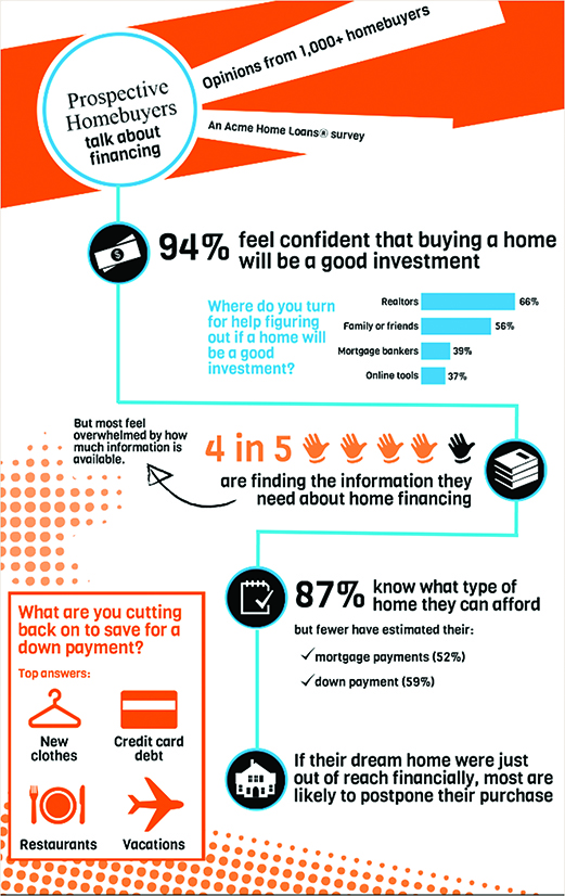
- Make it something to explore. People seem to love infographics that give them something to explore and discover. They become engaged and interested in how the data might apply, rather than suspicious or critical, which is how they often approach reports. Good infographics give readers a playful path to follow, moving from side to side and downward, like the infographic below we developed for a home mortgage provider
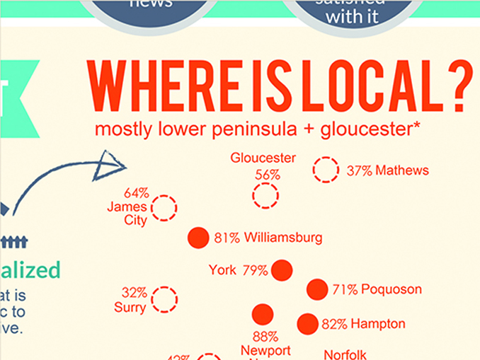
Here’s another example: We recently showed data points on a map without showing the map itself; readers quickly discovered that the points themselves created the outlines of the local geographic area. With this technique, the exploration entails solving an (easy) puzzle, which is engaging and fun to do.
- Tell a story. Of course, letting readers explore does not mean letting them infer conclusions from bunches of numbers and charts. They shouldn’t have to untangle data or wonder what it all means. So (as with all our analysis and reporting), we go back to fundamental principles of turning data into stories: focus on key questions, lay out simple data points, organize them thematically, summarize in a short headline, to name a few. I will highlight the most critical element here: Don’t write about the data, don’t write about the research, and definitely don’t make the infographic a data dump. Write about what the data proves—because that is the story that internal clients and managers really care about.
- Think in blocks. Thinking in blocks helps us order the layout and ensure that readers will not get lost when exploring. It’s the graphical equivalent of telling a story. Take the data and sort them into groups of related information. Then put those groups into a logical order that tells the story. Cut it down to three or fewer supporting data points per block. Then, in laying it all out, experiment with shuffling the blocks around to make the story clear while encouraging exploration at the same time. Maybe two blocks are side-by-side. Maybe one is a narrow block that slots in between two bigger blocks to break it up. As an example, the home mortgage infographic we created (see above) contains five blocks: four of them are anchored by each of the icons along the blue path that readers follow as they explore, and then a fifth block (in orange) is set off from that path.
- Use text as graphics. We think of text formatting as another opportunity to emphasize the story, minimize details, or give readers something to explore. It also helps us avoid the overuse of icons. For example, we might use text like this: “76 percent of workers agree that routine checkups are the most important benefit in an employer-sponsored health insurance plan.” Or, we might add a block of smaller, very descriptive text to give something for the audience to explore that is styled differently from the icons and short phrases in the rest of the infographic.
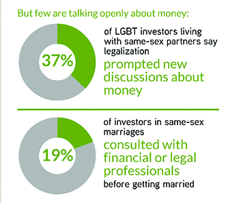
Here is an example snipped from an infographic we created about LGBTQ+ investors:
- Repeat visual elements, but break it up. Repeating visual elements like lines, icons in circles, dots, or a fancy triangle—anything, really—helps tie the different visual blocks together. It signals that the pieces belong to the whole. At the same time, it can feel boring if the same techniques are applied over and over, or if the layout is too symmetrical, or if every block follows the same style. So, we always introduce one element that breaks the pattern and adds something unexpected. Maybe it’s a really long sentence. Maybe it’s an arrow. Maybe it’s information in a box that juts in from the margin. Or maybe an icon in a different color.
- Remember, it’s a marketing tool. This is our most important tip of all. In our view, infographics should not be graphic-rich research reports. They should not even be executive summaries. They are like advertisements or super short press releases. We want them to grab attention immediately and provide just enough information that the viewer learns something, remembers it, and asks for more. If we find ourselves adding more numbers, or another layer to the story, or subtle distinctions that need explanation, or a chart with multiple elements… we stop ourselves. It’s a marketing tool, we say, not a report. So, leave it out.
The Payoff
So far, our efforts in creating infographics, and what we have learned, are paying off. It is paying off for us because having to develop an infographic pushes us to get tighter, shorter, and more useful stories out of the data. It is paying off for our clients because their research is getting noticed, both within and outside of their organizations. One RFP we received came with a specific request for infographics, as well. “Also, assume we will want at least one of your fabulous infographics,” our client wrote.
I still think that the bulk of infographics I see out there could use more work and a more critical eye. But, I’ve begun to appreciate how compelling research data can be with an extremely concise infographic “teaser” about the key research findings. With careful attention to the data and to the succinct story the data need to tell, I’ve learned that researchers can, indeed, create powerful and compelling research infographics all on their own.