 By Jaisy Desai, Qualitative and User Experience Research Consultant, Big Blue Banyan, Bangalore, India, jaisy@bigbluebanyan.com
The Journey So Far
In 2020 when we had nothing to do except stare at our little phone screens (yes COVID-19!), I decided I would use these little screens and do something productive with them. With absolutely no possibility to travel to meet clients and respondents, I decided that I would do more with technology than use it as a meeting place (i.e., video interview). I started using technology tools that help reveal respondents’ involuntary responses—including thoughts and feelings that respondents don’t even necessarily know they’re thinking and feeling.
It was a decision nudged by the pandemic, yet mainly driven by a social reality heavily influenced by the influx of smartphones. Asian countries, with a younger population and larger cohorts of digital natives, have seen a boom in launches of digital tech and software. This led to an increased demand and consolidation of local expertise in UX research and usability testing.
Ergo, I closed down my traditional qualitative research company and aligned myself with Big Blue Banyan, a research company that had launched into User Experience Testing for OTT (video content streaming) clients. They had the technological systems that enable collecting eye tracking, facial imaging, and EEG data through app-based programs.
At first, this all seemed daunting.
The objectives for research were completely different to me; for example, a client might need to understand what would take the online shopper to the shopping cart quicker or what kinds of buttons would get clicks—whether it would be hot search (providing ideas for products that everyone is buying), trending options, or time-bound flash sales buttons.
This new world also seemed daunting because key terminologies were as unfamiliar and different as the objectives when compared to traditional research. For instance, the language is direct and precise.
Research outputs were nothing like what I was used to.
Such started my career in user experience research or usability testing after so many years of listening mainly to verbally articulated responses. In the face of this challenge, I decided I would adapt and master this new language and learn how to use these gadgets to measure people’s nonarticulated or System 1 responses—the responses that are immediate, often unconscious, and often considered to be most accurate for conveying our emotions and habituated thinking.
What I have learned is both a new type of research—user interface and user experience research (UI/UX)—and a new way to leverage my traditional qualitative researcher skills.
Truly, if I had to describe my lifelong journey in qualitative research, I would say it is about a (Hero’s) Journey with a Thousand Faces (to quote American writer Joseph Campbell’s terminology). I started with pen and paper, audiotapes, desktops, then laptops, bulky cameras, sleek audio recorders, mobile cameras, and now research with apps. It has been a long road with new technologies as the road has moved forward. As these technologies changed, I have had to step up and into the learning challenges presented. We are currently in the midst of an exciting phase because never before have we been so close to the consumer as to see their eyebrows twitch or eyes blink.
When I started my journey with qualitative research, the words of the consumer were sacrosanct—quotes were highlighted, colored to denote emotions, with more quotes signaling greater credibility. It was all about words! I not only searched for words in transcripts, I searched for synonyms from the thesaurus and collected words that wove a pattern. I found words that crystallized people’s perceptions and defined their beliefs, which, in turn, helped create the gem of an insight that floored the marketers.
Being the intuitive qualitative researcher, I quickly moved on to images to help consumers express themselves better and to build a better story for the client. But for most clients, the use of images was mumbo-jumbo, not sufficiently professional, rational, or even logical.
Then came mobile cameras and entering people’s homes and party scenes with cameras in hand. Then came the self-completed diaries that brought the consumer alive in myriad ways and made images more personal. Images of consumers in their context of home, leisure, party, etc., helped us get and give a sense of the real consumer world and a better expression of the “reasons why.”
Today, we have mobile apps that record details about consumers that they are not even fully conscious about, like facial expressions, emotions, and eye gaze. So now we not only have the words, images, and context-based pictures of the consumer, we also have the consumers represented through EEG, facial coding, etc.
Isn’t this a truly exciting phase of our work and career!
But for all the physical proximity to our subject, the “reasons why” are still tucked away in the depth of one’s mind—important information to be surfaced. This is why the qualitative researcher will never go out of fashion.
Technology advancements have given us qualitative researchers powerful tools; they are like a scientist’s microscope. But the “reasons why” still need to be probed, delved into, and represented as a human need.
Where I Am Now
User experience research is an entirely different ballgame versus traditional qualitative. The new language, the simplicity of objectives (Does the new Cashback icon stand out on a homepage or does it not?), micro-objectives (Is the color used for Cashback appropriate given the color of the homepage?), and the resulting split-second decisions made by a customer are things I never imagined I would be involved with at this stage in my career. Just think about it: you are studying a two-by-four-inch screen and a multitude of decisions people make looking into this tiny screen.
For a shopping app, this small screen packs in as much as 25 to 35 elements on every single page—whether homepage, search results page, product display page, check-out page, and order management page—all of which contribute to the journey toward the purchase of products.
Just the homepage, which is one single page in the customer’s journey to purchase, includes search buttons, image search, product displays/images, name, description of products, promotion, price, plus other icons and badges; each element calls out for customers’ split-second attention while they navigate through a shopping app.
Similarly, on a content app, the homepage not only has a lot of content (like movies, serials, or documentaries), but it also has many buttons that we do not notice very often. As UX researchers, we search for the impacts of choices customers are making in microseconds.
On one hand, user experience research seems easier, especially when compared to the times I searched over reams of verbally articulated responses to find that one big insight that can change the trajectory for the brand. Here, every micro element you research can reveal an insight that helps improve the customer’s journey.
On the other hand, the additional information in the form of involuntary responses requires even more time and effort to decipher because the consumers themselves are unable to articulate a reliable explanation. This is how I realized that I needed my “traditional qualitative” tool kit of theories and frameworks even more than before. After all, user experience is still about unraveling the consumer’s thought process and their mind.
Applying “Traditional” Theories on User Experience Research
This is the part where we take user experience research to the next level. This is the part where, as UX researchers, we qualitative researchers differentiate ourselves from the many “tech researchers” who have normalized “quick and dirty” research. We can fall back on our theoretical frameworks, models of behavior, etc., and bring them to the context of user experience research and consumers’ interaction with technology.
There are many frameworks we can use in the context of UX research to achieve a holistic understanding of the consumer’s journey within a shopping app or an OTT (video content streaming platform). Let us look at some.
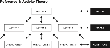
- Integrating UX with Activity Theory (see Reference 1). UX research is often about finding the right logical flow and smallest number of steps for users performing activities. Activity Theory proposes a hierarchical structure to describe this: the activity (oriented toward a motive) is composed of (goal-oriented) actions, that are in turn composed of smaller operations. This gives us a framework for the less intuitive activities in the user journey.When we look at users’ interactions with content-based apps or shopping apps, some activities are intuitive, while other activities are less intuitive and must be learned by users. In a video streaming app, for example, placing the login button at the center of the app is about intuitive design.
By contrast, a user changing subtitles to the language of their choice is a less intuitive, multistep, learned behavior (which the user will end up having to do repeatedly). In this case, the UX researcher needs to discover the path of least resistance (fewer obstacles or fewer steps) to make it easy to learn how to change subtitles. This is enabled by plotting the journey using the three-level hierarchy: motive (enjoy the watching experience) that determines the goal (learn how to change subtitles) that can be achieved by different sequences of actions and subordinate operations (e.g., finding Help Center > searching for the subtitle function in a drop-down in Help Center or using the search bar to locate subtitle functions). This way the researcher can identify the shortest, most logical pathway toward the desired goal.
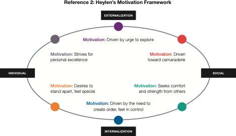
- Another framework that I find very useful when I do user experience research is the Motivational Framework. Understanding consumer motivations toward a category helps us distinguish triggers and barriers for both the category and the process of online shopping for that specific category.I typically use Heylen’s model (see Reference 2) to understand shopper motivations toward the category/brand purchased and what motivates them to use that brand’s app—whether it’s convenience, reassurance, or the chance to publicly share purchases.
Heylen’s model tries to understand what drives a person toward a particular goal or outcome by understanding the individual’s desire to express or repress, and the individual’s orientation toward their own self and toward others/social. Six underlying motivations are derived from this perspective: desire for control, reassurance or comfort, recognition, desire for perfection, affiliation, exploration.
It’s interesting to see the pattern of behavior of someone who is driven by recognition—to see how their journey on a shopping app goes along with their journey with the brand, and even their journey on a social media app. They would very often make a purchase on a shopping app and post it on social media—as they meet their need for recognition through showcasing either their strengths or good looks. By comparison, a consumer driven by the need for control shops on the app to make sure they have the product on time and are very likely to track delivery many times a day. All of this to ensure she has the black shirt that she’s planning to wear next Tuesday for the big meeting.
- An online shopping app is a complex world. It includes things like barcodes, homepage banners, channels, channel icons, flash sale modules, category modules, product tiles, product display pages, badges, search results pages, pop-up vouchers, count-down pages, logistic pages, etc.Each tool and each bit of information relays its own meaning, but each tool also interacts with the other bits of meanings and tools.
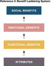
For example, icons have their own functional role, but at the same time they can contribute to the communication of higher-order benefits of the app. The Benefit Laddering System (see Reference 3) helps us explore the various benefits ascribed to different features and the consequences and values that consumers derive from these. In the icons example, it can help us pick the right icons and discard the wrong ones. For example, an app that focuses on bargains will have icons and badges with symbols that reinforce the idea of saving, making a good deal, or feeling smart. As compared to an app which focuses on design/style and overall premium experience, where the icons need to convey different benefits about sophistication or luxury.
While these are a few of the frameworks that I have used to understand user experience better, I’m sure there are many more that we can pull out from our toolkit. Our journey and quest for better understanding of consumers/shoppers irrespective of the context (whether voluntary or involuntary responses) is a progressive journey that is marked by excitement, learning, and use of our fundamental knowledge.
UX research today is in the hands of the true qualitative researchers who will go beyond superficial explanations of user experience and connect with the deeper aspects underpinning people’s behavior.

