
Have you ever sat through a boring research report? Slide after slide of data, quotes, and analyses. For the average researcher, data is where we thrive—where we find enjoyment and satisfaction. However, for many of those outside our sphere…not so much.
Presenting research results, and qualitative projects in particular, in an engaging way has always been a challenge. Words and feelings are tough to translate into infographics, and even video only begins to scratch the surface.
We wanted to find out if there was a way to stop stakeholders from glazing over and start actively discussing the facts in front of them. So, we turned to the most creative of mediums: art.
Presenting Insight as Art
To find out whether art could be a useful medium for engaging research stakeholders, we conducted a simple experiment, one so easy you can replicate it with minimal investment. Here’s what to do.
Two stages are required to conduct this experiment, a data-gathering phase and a creative phase. To get the qualitative data that will form the basis of the final art piece, we asked consumers a series of three questions across a three-day bulletin board:
- Day 1 – What initially comes to mind when you think about [brand/product]?
- Day 2 – What have been your previous experiences, or what experiences would you expect to have with [brand/product]?
- Day 3 – How would you sum up your feelings towards [brand/product]?
These high-level questions, along with the resulting discussions on bulletin board threads, provide the qualitative depth required for the second stage, creating the artwork. To do this, we gathered a team that included a researcher, a copywriter, and a designer who discussed the verbatim responses. The team examined common themes, experiences, attitudes, and feelings.
The goals of these brainstorming sessions should be to find both the artistic subject and style that fittingly represent the most prominent and emotive aspects expressed in the qualitative bulletin board group discussions.
In this context, “style” refers to the artistic approach used to portray a theme. For example, the cubism artistic style can suggest a brand is out of touch, while digital renderings tend to convey a sense of modernity. Deconstructivism can suggest a lack of order, and watercolor a sense of familiarity.
“Subject” is what images to include in the artwork and what they represent. Subjects can include vehicles, buildings, landscapes, scenes, products, characters, portraits—almost anything. Some of our favorite examples include using the subject of a character mascot to illustrate positivity, or a ballet dancer to represent a brand that holds a steadfast position in a turbulent industry.
To illustrate how style and subject come together in the artwork representing the online focus group discussions, here are two examples we developed for B&Q (a DIY home improvement brand) and Screwfix (a trade building and home improvement supplier).
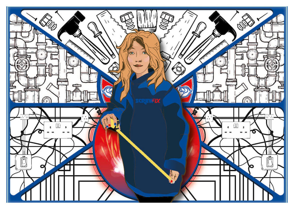 Feedback on the Screwfix brand highlighted two key, overwhelmingly positive points. First, staff are viewed as heroes; extremely sympathetic about challenges a tradesperson may have in addition to an encyclopedic knowledge of the store’s inventory. Second, the breadth of products and building materials is huge. To reflect this, the creative team chose a style reminiscent of a movie poster that riffs off of heroic tropes, placing our subject (the staff) front and center, against a backdrop of products.
Comparatively, feedback on the B&Q brand portrayed the store as the go-to place for non-trade DIY projects. The focus here was on the modernity of the store, how up-to-date its selection is, and how it empowers consumers throughout the life cycle of a project, from idea to completion. The artwork reflects this by making use of a digital style, completed by home improvement projects at various stages of finalization as the subject. To round it off, the subjects are deliberately set in an imaginary mind space, making the connection between dreams and reality.
Practical Advice for Better Engagement
At this point, it’s important to look beyond specific examples to what we’ve learned from this experiment, and what smaller takeaways can be applied in an everyday context. Here are a few key recommendations:
- Results are significantly more impactful if delivered in a way that requires a degree of cognitive effort to understand (a well-documented phenomenon in advertising). In fact, we’ve found where issues are highlighted in a more challenging style, stakeholders are more motivated to engage in a search
for solutions. - Unexpected and unusual reporting formats stimulate conversation among stakeholders, but it is still vitally important that this debate is steered by researchers with a deep understanding of the data to ensure accurate interpretations.
- It’s possible to make important insights more accessible and memorable by taking them outside of their typical report or presentation context. Posters, coffee cups, clothing, desk decorations, and other everyday objects are prime real estate.
Integrating the unique and unexpected into your research reports, whether that’s in their medium, format, or presentation, helps to engage stakeholders with the research findings. Engaging stakeholders doesn’t have to be difficult. With a little creativity, it’s much more achievable than we think.
Be the first to comment